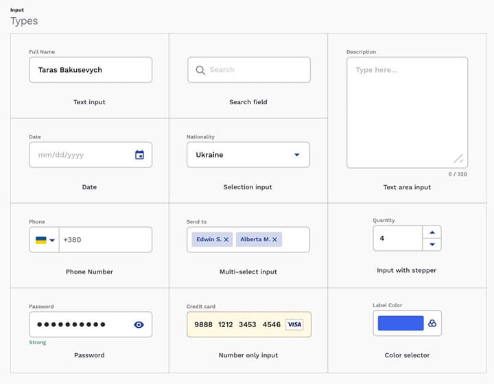
Most of the options presented in the picture below are based on the basic Text field element, which developers modify to better handle certain types of data: dates, phone numbers, numbers, credit cards, passwords, etc.
Use a suitable type of text box
It is important to choose the correct type / design of the Text field element – this allows you to quickly and without errors enter data in the correct format. This approach greatly simplifies the process of interacting with the form, making it as efficient and enjoyable as possible.
Dependence of field design on user actions
A text box (like buttons) should change its appearance as it interacts with users. This will be a kind of visual clue signaling the state of the element: inactive, error, disabled, hovering, in focus, etc. Each of these statuses should have their own easily identifiable design options that are understandable to the user.
