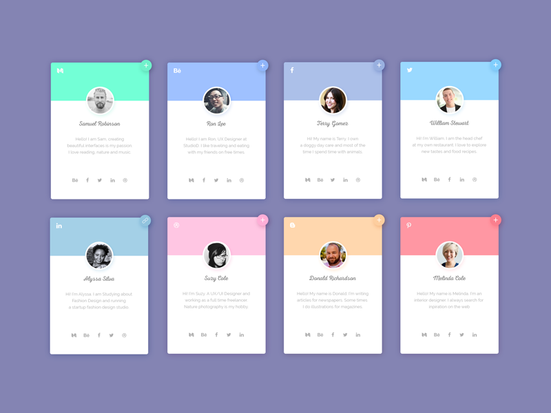
The design of cards must be taken seriously enough. You have little “room to maneuver”, and a lot depends on this component. If they are not designed to be user-friendly and effective enough, it negatively affects the final user experience. Today we will share with you the translation of this article, which contains a selection of useful tips on how to make your card design better.
- Lists and tables
Let’s start a little from afar. There are situations when cards are generally not worth using. For example, if you have homogeneous content with content that is less than a few lines, a list layout looks better. Then it will be much faster to view such information.
- One idea – one card
You should not use the output of multiple objects in this element, it is better to present each of them as a separate map. The same slider in the preview, if displayed in each card, will only distract and additionally load the web page.
- No unnecessary links
It is highly discouraged to add links to a short text description, the card should have only one link – from a button / picture or by clicking on it. This does not look pretty, and may direct the site visitor to the wrong place.
