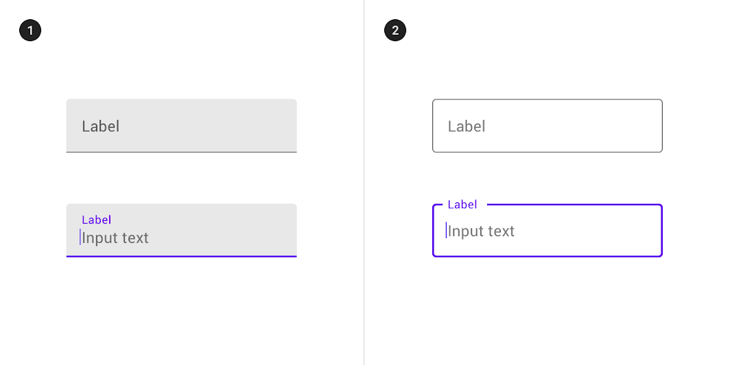
Earlier in the blog there was already a note about the design of text fields, but there we covered only a couple of basic questions, although in fact there are many more interesting nuances in this topic. Today we will try to catch up and make a more detailed and comprehensive article. Stylistically, it will be similar to a post about effective button design in interfaces. This is not surprising, because both materials are translations of the same author, who writes quite well about different elements of the user interface.
Everyone has probably come across forms to fill out on sites and in applications. They greatly simplify the process of obtaining the necessary information.
Given that technological progress does not stand still, the mechanisms for collecting data are gradually changing. Below we will consider some new ideas and solutions from developers regarding text fields, which will improve the design and usability of authorization forms, feedback forms, surveys, etc.
Text field structure
With this UI element, users can enter different text information in site / application forms and dialog boxes. Absolutely all the details of the text field should be as clear as possible – this will facilitate its correct filling.
The design of the element should be such that anyone can easily find it on the page and enter the necessary information without any difficulties. The picture below shows the main components of the field:
